Bootstrap Carousel Plugin
The Carousel Plugin
The Carousel plugin is a component for cycling through elements, like a carousel (slideshow).
This plugin is included in "bootstrap.js" (or in the minified "bootstrap.min.js" file).
 |
Tip:
Plugins can be included individually (using Bootstrap's individual *.js files), or all at once (using
"bootstrap.js" or "bootstrap.min.js").
Bootstrap's individual .js file
for Carousel is named "carousel.js".
|
Carousel Example
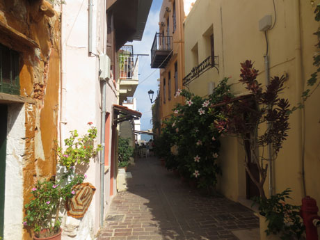
Chania
The atmosphere in Chania has a touch of Florence and Venice.
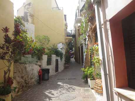
Chania
The atmosphere in Chania has a touch of Florence and Venice.
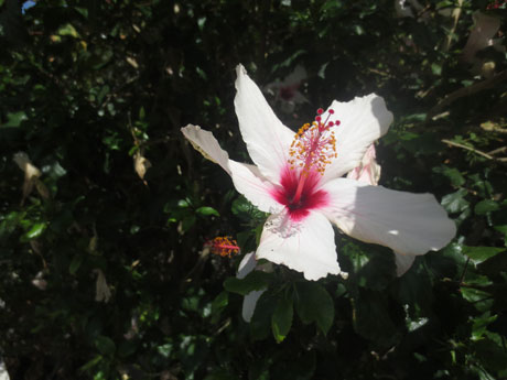
Flowers
Beatiful flowers in Kolymbari, Crete.
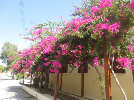
Flowers
Beatiful flowers in Kolymbari, Crete.
Previous
Next
|
Note: Carousels are not supported properly in Internet Explorer 9 and
earlier (because they use CSS3 transitions and animations to achieve the slide effect).
|
How To Create a Carousel
The following example shows how to create a basic carousel:
Example
<div id="myCarousel" class="carousel slide" data-ride="carousel">
<!-- Indicators -->
<ol class="carousel-indicators">
<li data-target="#myCarousel" data-slide-to="0" class="active"></li>
<li data-target="#myCarousel" data-slide-to="1"></li>
<li data-target="#myCarousel" data-slide-to="2"></li>
<li data-target="#myCarousel" data-slide-to="3"></li>
</ol>
<!-- Wrapper for slides -->
<div class="carousel-inner"
role="listbox">
<div class="item active">
<img src="img_chania.jpg" alt="Chania">
</div>
<div
class="item">
<img src="img_chania2.jpg"
alt="Chania">
</div>
<div
class="item">
<img src="img_flower.jpg"
alt="Flower">
</div>
<div class="item">
<img src="img_flower2.jpg" alt="Flower">
</div>
</div>
<!-- Left and right controls -->
<a
class="left carousel-control" href="#myCarousel" role="button" data-slide="prev">
<span class="glyphicon glyphicon-chevron-left" aria-hidden="true"></span>
<span class="sr-only">Previous</span>
</a>
<a
class="right carousel-control" href="#myCarousel" role="button"
data-slide="next">
<span class="glyphicon glyphicon-chevron-right"
aria-hidden="true"></span>
<span class="sr-only">Next</span>
</a>
</div>
Try it Yourself »
Example Explained
The outermost <div>:
Carousels require the use of an id (in this case id="myCarousel") for carousel controls to
function properly.
The class="carousel slide"
specifies that this <div> contains a carousel.
The data-ride="carousel"
attribute tells Bootstrap to begin animating the carousel immediately when the page loads.
The "Indicators" part:
The indicators are the little dots at the bottom of each slide (which indicates how many slides there are in the
carousel, and which slide the user are currently viewing).
The indicators are specified in an ordered list with class .carousel-indicators.
The .data-target class points to the id of the carousel.
The .data-slide-to class specifies which slide to go to, when clicking on the specific dot.
The "Wrapper for slides" part:
The slides are specified in a <div> with class .carousel-inner.
The content of each slide is defined in a <div> with class .item. This can be text or images.
The .active class needs to be added to one of the slides. Otherwise, the carousel will not be visible.
The "Left and right controls" part:
This code adds "left" and "right" buttons that allows the user to go back and
forth between the slides manually.
The .data-slide class accepts the keywords "prev" or "next", which alters the slide position
relative to its current position.
Add Captions to Slides
Add <div class="carousel-caption"> within each <div
class="item"> to create a caption for each slide:
Example
<div id="myCarousel" class="carousel slide" data-ride="carousel">
<!-- Indicators -->
<ol class="carousel-indicators">
<li data-target="#myCarousel" data-slide-to="0" class="active"></li>
<li data-target="#myCarousel" data-slide-to="1"></li>
<li data-target="#myCarousel" data-slide-to="2"></li>
<li data-target="#myCarousel" data-slide-to="3"></li>
</ol>
<!-- Wrapper for slides -->
<div class="carousel-inner"
role="listbox">
<div class="item active">
<img src="img_chania.jpg" alt="Chania">
<div class="carousel-caption">
<h3>Chania</h3>
<p>The
atmosphere in Chania has a touch of Florence and Venice.</p>
</div>
</div>
<div
class="item">
<img src="img_chania2.jpg"
alt="Chania">
<div
class="carousel-caption">
<h3>Chania</h3>
<p>The atmosphere in Chania has a touch of Florence and Venice.</p>
</div>
</div>
<div
class="item">
<img src="img_flower.jpg"
alt="Flower">
<div
class="carousel-caption">
<h3>Flowers</h3>
<p>Beatiful
flowers in Kolymbari, Crete.</p>
</div>
</div>
<div class="item">
<img src="img_flower2.jpg" alt="Flower">
<div class="carousel-caption">
<h3>Flowers</h3>
<p>Beatiful
flowers in Kolymbari, Crete.</p>
</div>
</div>
</div>
<!-- Left and right controls -->
<a
class="left carousel-control" href="#myCarousel" role="button" data-slide="prev">
<span class="glyphicon glyphicon-chevron-left" aria-hidden="true"></span>
<span class="sr-only">Previous</span>
</a>
<a
class="right carousel-control" href="#myCarousel" role="button"
data-slide="next">
<span class="glyphicon glyphicon-chevron-right"
aria-hidden="true"></span>
<span class="sr-only">Next</span>
</a>
</div>
Try it Yourself »
Color Picker


